A full redesign vision for a $100B+ active asset manager. Grounded in a rigorous UX audit, a personalization strategy built around four clearly defined audiences, and an AI-driven content framework built around who each visitor actually is.
I led the experience strategy from start to finish, directing two designers and driving decisions across every phase of the work. The core challenge wasn't a design problem. It was a strategic one. How do you build a single experience intelligent enough to serve four fundamentally different audiences without ever feeling like it's trying to serve all of them at once? The answer started with a clear point of view on AI. It shouldn't feel like a filter. It should feel like the site already knew who you were and got smarter with every visit. That thinking drove every decision I made, from the first audit finding to the moment I presented the strategy directly to First Eagle's leadership.
Starting PointThe existing firsteagle.com had solid bones. Clear navigation, an established audience segmentation model, and the instinct to serve different content to different visitors. But the execution hadn't caught up. Individual investors, financial professionals, and institutional allocators each encountered a slightly different homepage, with that variation having grown without a clear strategy behind it. The audience differentiation was real, but the experience felt arbitrary rather than designed. The site had the right instinct. It needed the right strategy to stand on.
Three questions shaped the evaluation. Did the site communicate its purpose clearly to the right audience? Could users do what they came to do? And did the experience look and feel like a firm worth trusting? Every finding was specific, evidenced, and tied to a recommendation.
Brand message invisible to most visitors.First Eagle's investment philosophy was buried below the fold. For an individual investor arriving from search, the first impression was generic, with nothing above the fold to distinguish the firm from any other asset manager.
Audience segmentation was working against itself.The site asked visitors to identify themselves in multiple locations inconsistently, interrupting browsing rather than guiding it. The feature designed to personalize the experience was actively making it worse.
Accessibility barriers were shutting people out.The cyan accent color used throughout failed WCAG 2.1 AA contrast requirements. For a firm whose individual investor audience includes retirees and older adults, this isn't a technical oversight. It suggests the experience wasn't truly built for the people it's meant to serve.
Interactions were inconsistent, which undermined confidence."Learn More" is not a call to action. Hover states were missing from some components and present on others. For first-time visitors, that inconsistency undermines confidence before they've read a word.
The visual hierarchy wasn't legible.Headers, button labels, and publication dates shared the same color and weight throughout. White text on dark blue backgrounds created dense, hard-to-scan interfaces. Technically readable, but exhausting at scale.
The brand imagery told the wrong story.First Eagle's guidelines defined two approved image styles, aerial photography and micro-detail imagery. Flower photography on the homepage hero fit neither, contradicting the firm's own brand identity on the page most visitors see first.
Every finding pointed to the same underlying problem. The site didn't know who it was talking to.
One thread ran through nearly every finding. The site didn't have a clear sense of who it was talking to at any given moment. Not because it hadn't tried. It had already begun differentiating content by audience. It just had no strategy behind it. Without a defined framework, the audiences weren't clearly characterized, the differentiation wasn't principled, and the experience felt inconsistent rather than intentional. A fragmented personalization is worse than none at all. It tells users the firm tried but didn't finish.
Default / CorporateVisits are exploratory and unhurried. No investment decision is on the table. Just a first impression forming. The experience needed to answer one question. Who is First Eagle, and why should I pay attention?
Individual InvestorVisits are short and decisive. Complexity ends the session. The design needed to strip back everything and answer one question. Can I trust this firm with my money?
Financial ProfessionalEvery visit arrives with a specific question and zero patience for marketing content. The persona that came out of research was an independent RIA managing $180M AUM across dozens of high-net-worth clients. Frustrated by marketing-heavy content and a lack of accessible due diligence materials, this advisor needed to build confidence in the investment team and find thought leadership credible enough to bring to clients. The experience needed to surface exactly that, immediately.
Institutional InvestorA long-term allocation is on the table, and they will read everything available. The experience needed to present depth without burying it. Performance data, track records, and risk philosophy all accessible without layers of navigation built for a different audience.
With the audience strategy in place, the work turned to finding a design direction to hold the experience together.
BenchmarkingRather than look within the category for a visual language it hadn't yet produced, the exploration drew from editorial brands, premium consumer platforms, and experience-forward digital products. These were references that had already solved the challenge of making complex, high-stakes information feel navigable and trustworthy, presenting depth without overwhelming the people who needed it most. The goal was to bring that same clarity and confidence to a financial services context where it rarely exists.
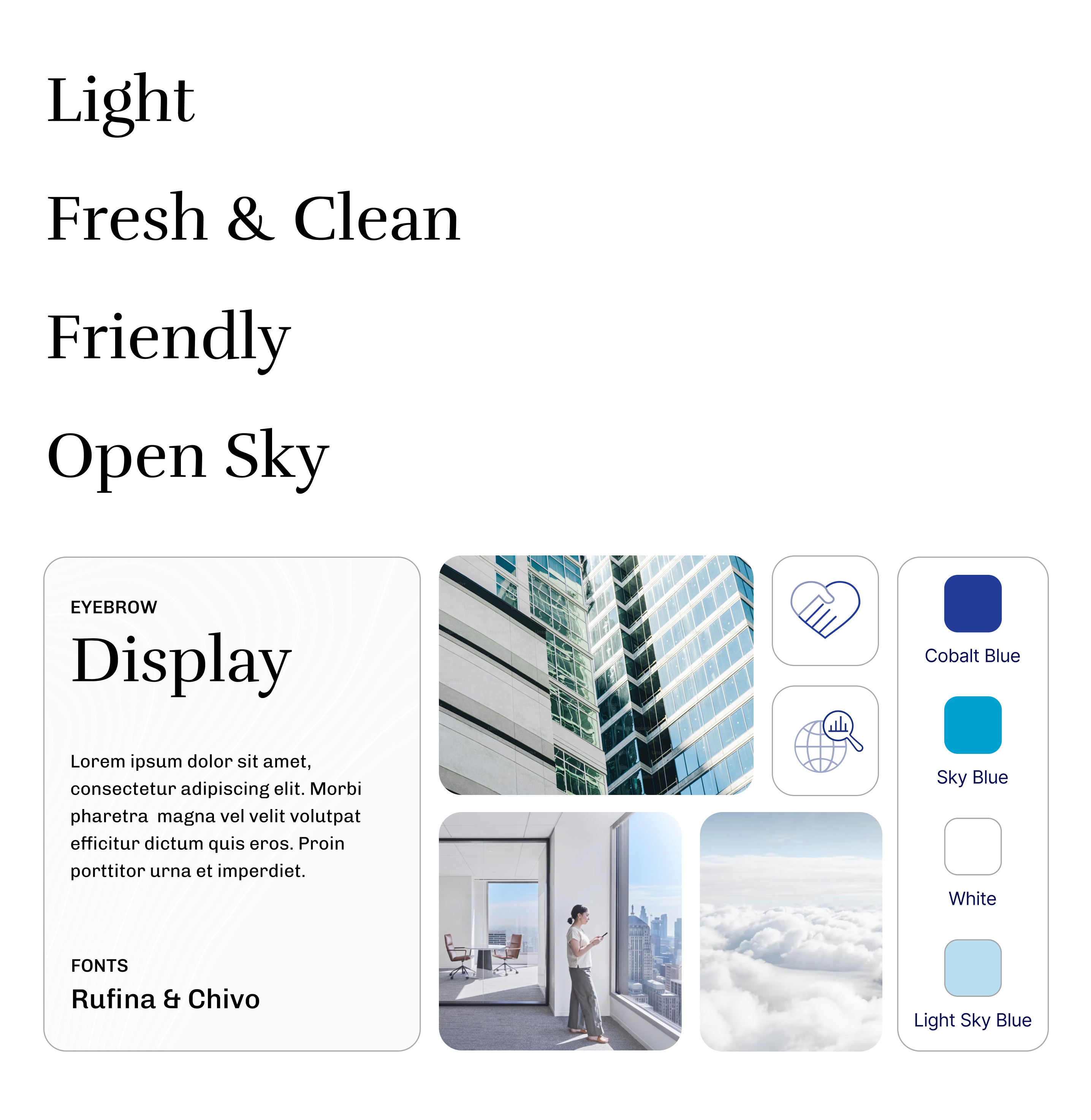
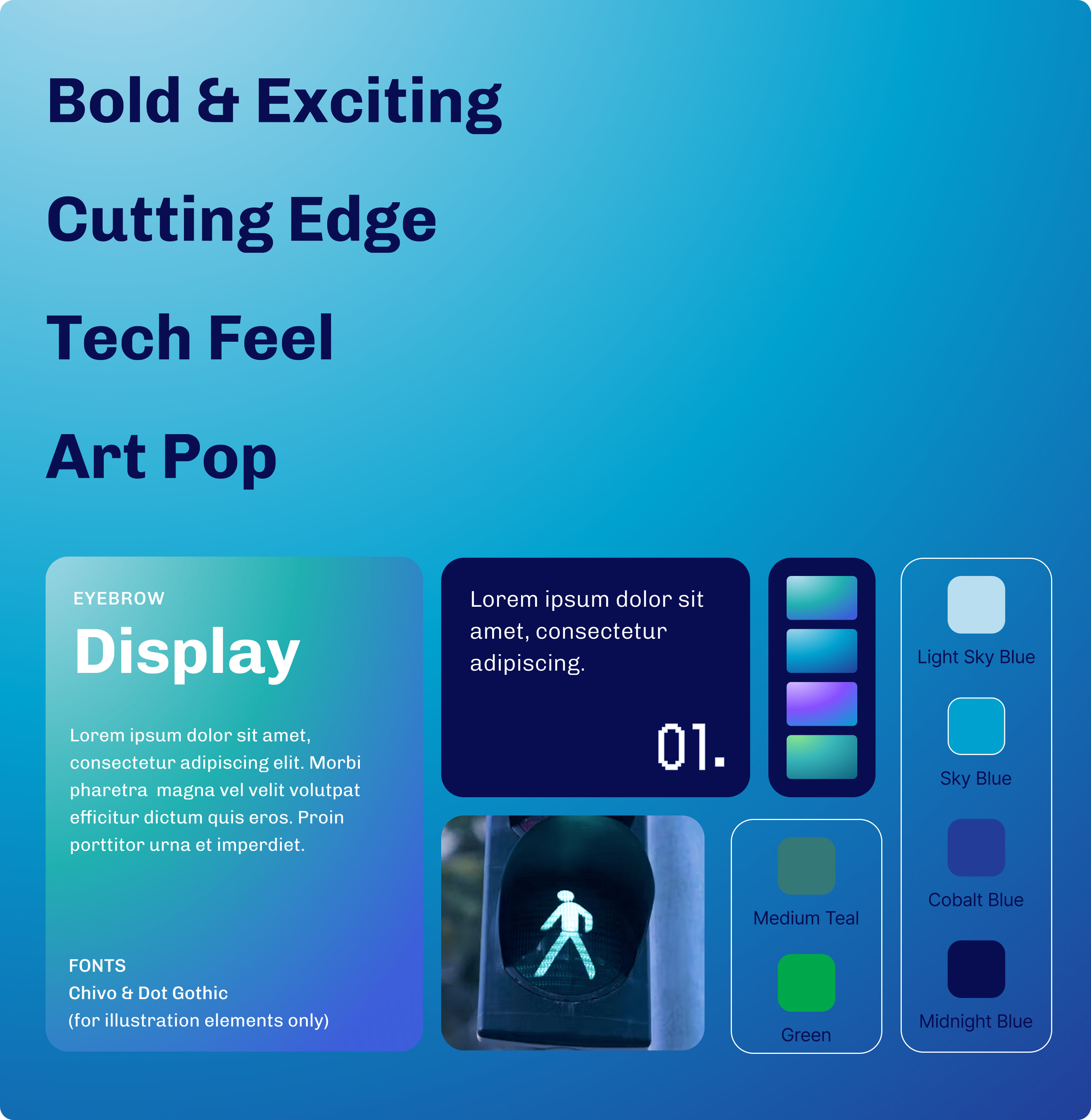
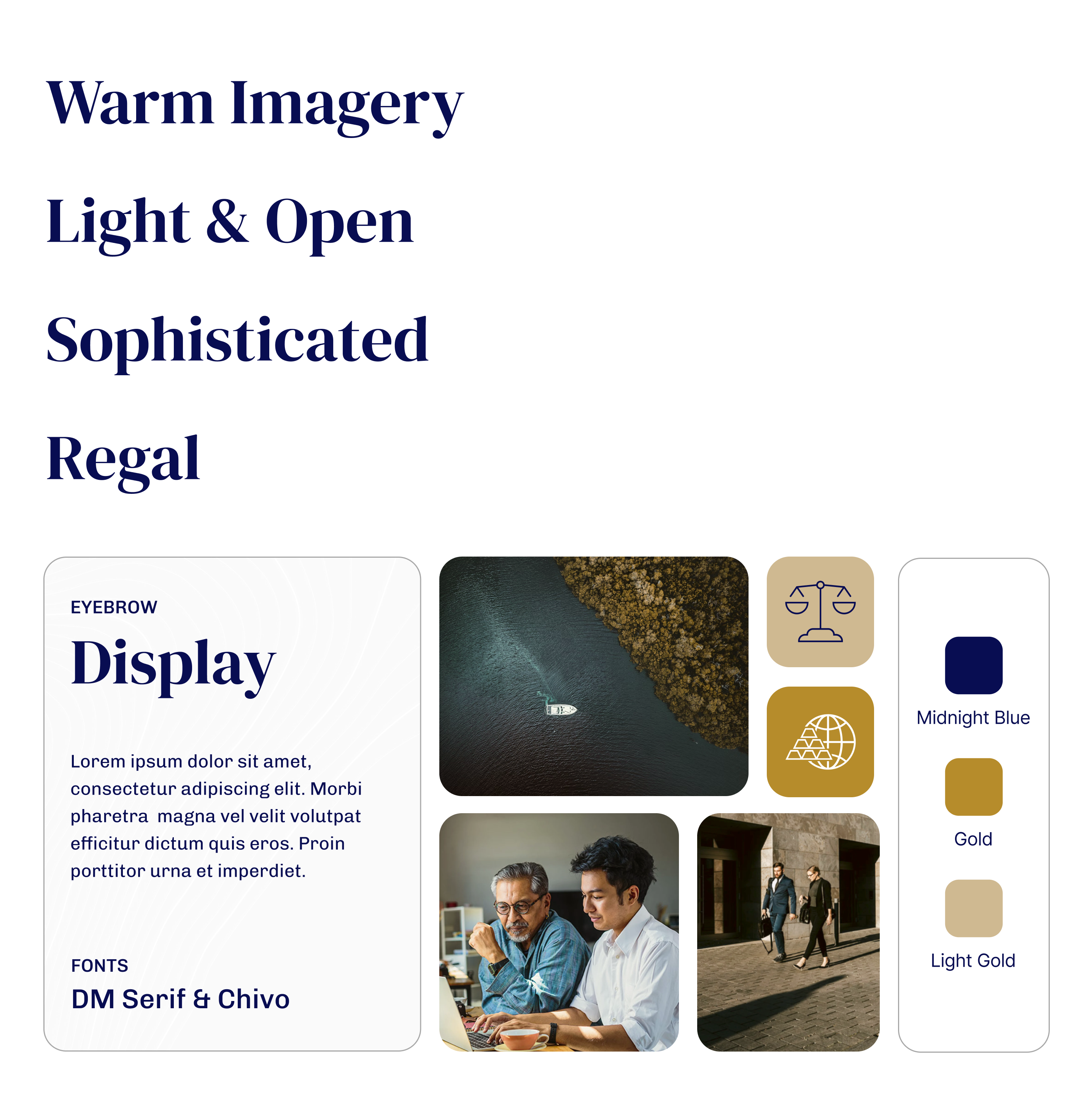
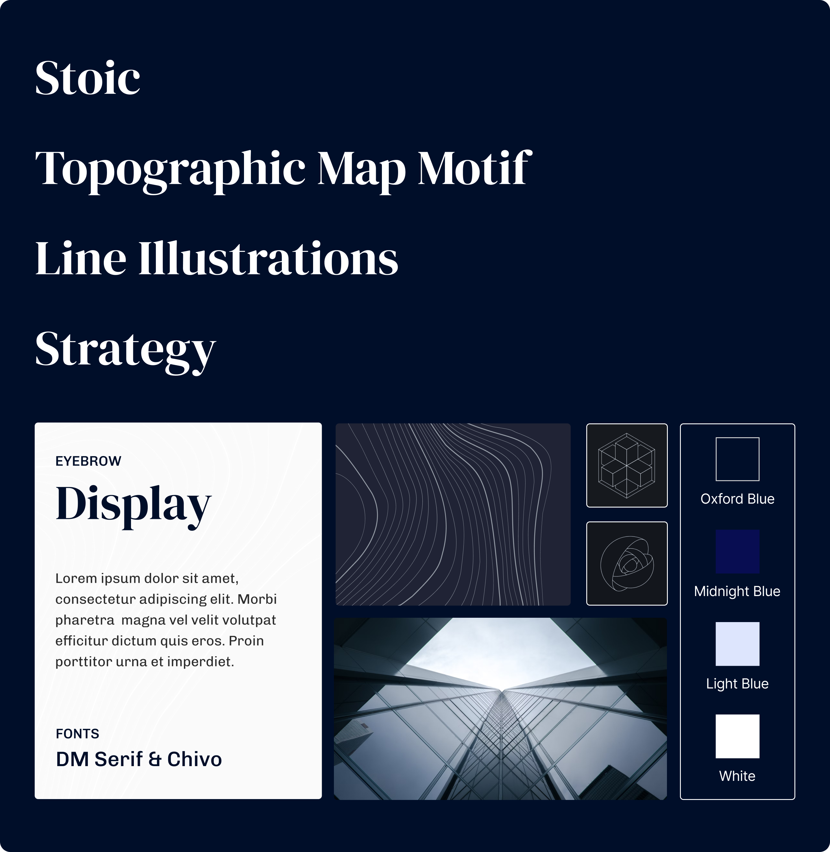
Design PositionsI directed the designers to push past what they assumed would be acceptable for a financial services brand. Four design positions emerged from that exploration, each a distinct point of view on how a redesigned First Eagle could look and feel. Not mood boards. Each one was a fully considered design position, a deliberate stance on typography, color, imagery treatment, and tone, with a visual direction that gave it its own character and emotional register.
One direction, Bold, went further than the category typically allows. A deliberate proof that the brand could take a more striking visual stance and still feel entirely credible.
The four positions were reviewed internally. Stoic and Warm were identified as the most realistic to build on, with imagery directions that were more grounded and better suited to what the brand could credibly carry into the next phase. All four were presented to the client to demonstrate the full range of thinking and how far the exploration had pushed beyond the category.
From there, the work moved into context.
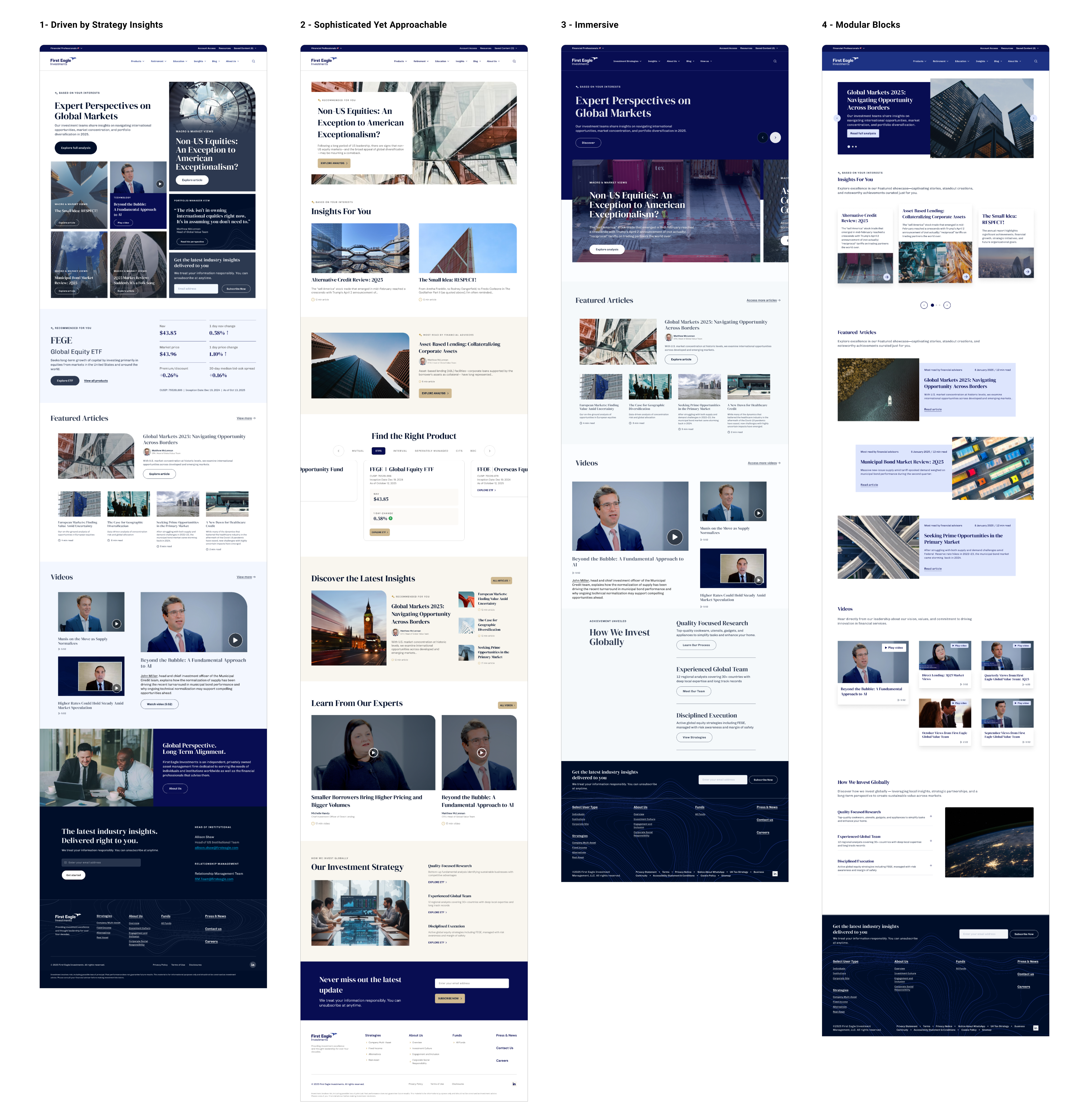
Homepage ExplorationsFrom Stoic and Warm, four homepage concepts were developed, each pushing those two directions further in context, not just as palettes or moods but as real experiences with layout, hierarchy, imagery, and content decisions baked in.
I reviewed the directions with the broader team, presenting all four concepts to show the full depth of the work and making the case for Driven by Strategy Insights as the recommended direction. The visual foundation was set. The harder question came next.
With the visual direction in place, the work turned to the harder question. Four distinct audiences, each needing a fundamentally different experience. The answer was to build one site intelligent enough to adapt to all of them, not by treating AI as a feature, but by embedding it as a connected system where each layer builds on the signals generated by the one before.
The system works in three layers, each building on the one before: audience type establishes who you are, session behavior deepens that understanding, and logged-in history compounds it over time.
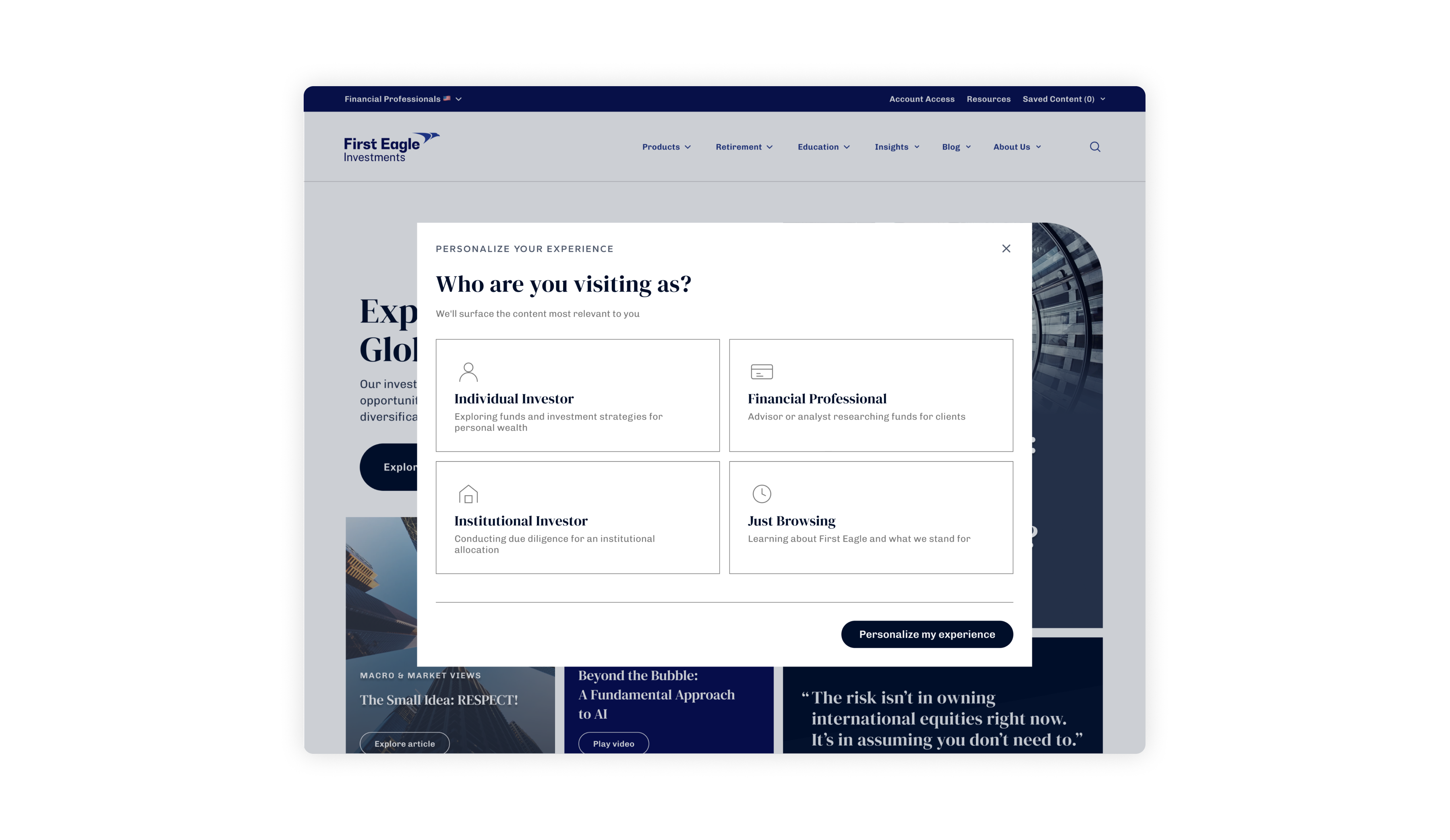
The system was designed to start working from the very first visit. A single prompt establishes audience type in one step, shaping what content surfaces above the fold, which funds are featured, and which calls to action appear. Site-wide personalization set in a single moment. From there, session behavior continues the work quietly, with content browsed, searches made, and time spent all informing what comes next.
For logged-in users, the intelligence was designed to compound further. Each return visit would build on the last, developing a profile around focus areas and content history that shapes not just what surfaces, but how it's framed for that specific investment context.
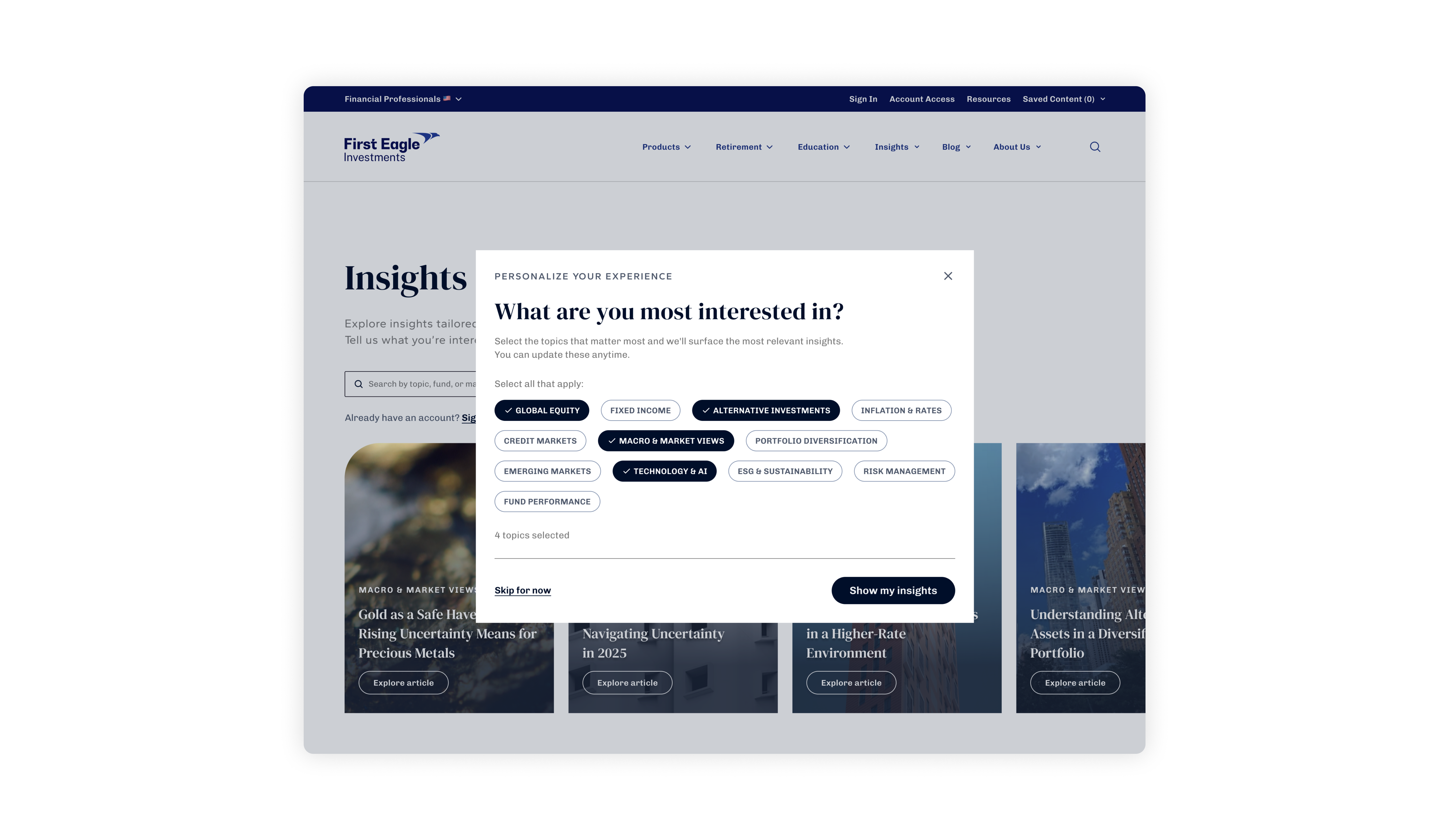
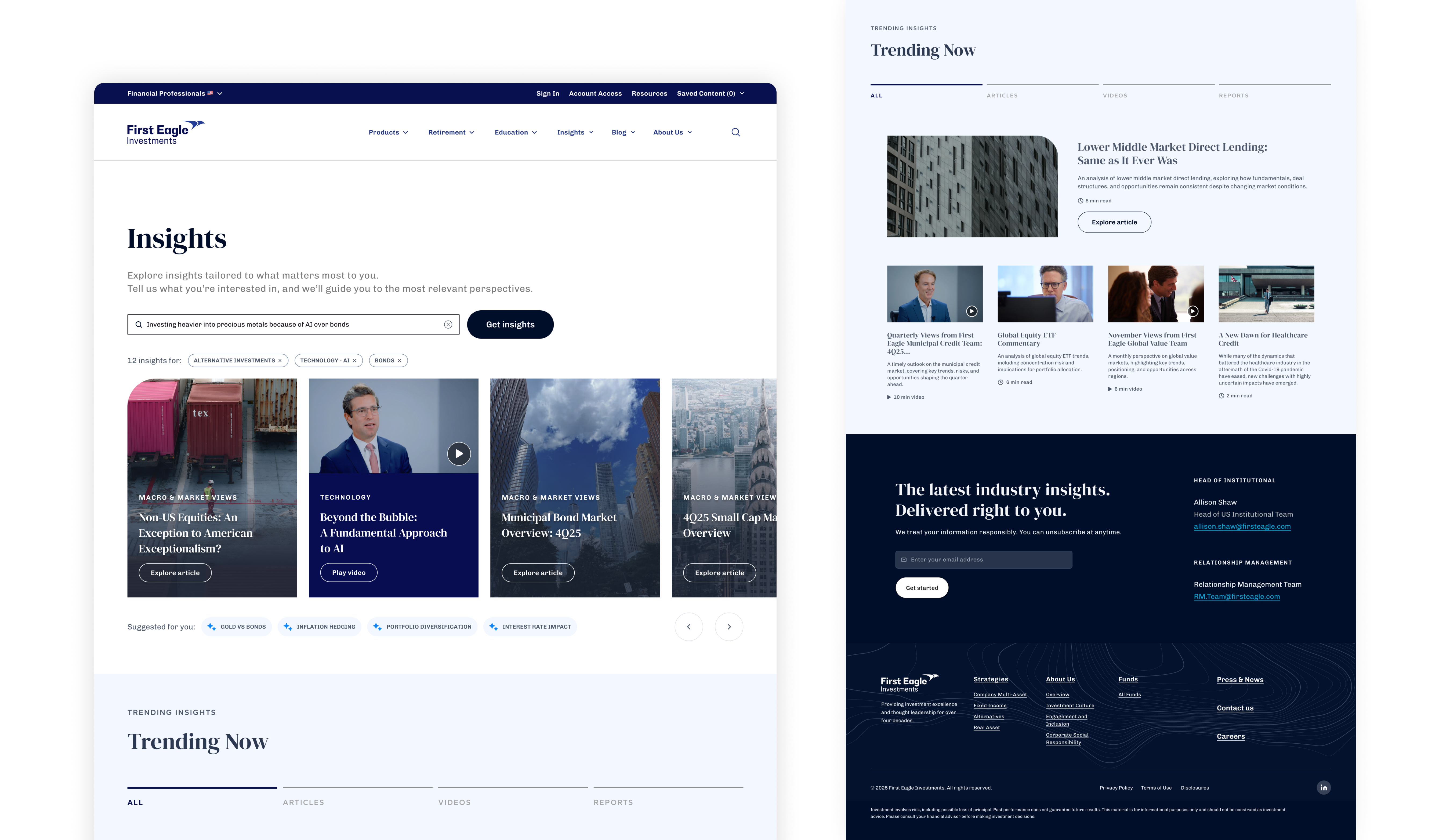
Insights HubThe Insights page was where the personalization was designed to show itself most clearly. Not as a notification or a label, but as a feed that already knew what mattered to each visitor before they had asked.
Audience type alone told the system who each visitor was. Topic interests told it what they actually came to read. On first visit to Insights, a brief prompt would invite visitors to select the subjects they cared about from a set of topic pills, with the option to skip or update at any time as their interests evolved.
Search IntelligenceThe search experience was built to read intent, not just match terms. Searching for inflation wasn't meant to return everything First Eagle had published. It was designed to return what was most relevant to each visitor's investment context. An Individual Investor and an Institutional Investor asking the same question would surface different answers, because they needed different answers.
Results were filtered by each visitor's investment context, not matched across the full archive. A row of suggested content below the results would surface what they might want next, informed by what they had already engaged with. For logged-in users, results were designed to go beyond First Eagle's editorial defaults entirely, shaped instead by actual investment focus and browsing history.
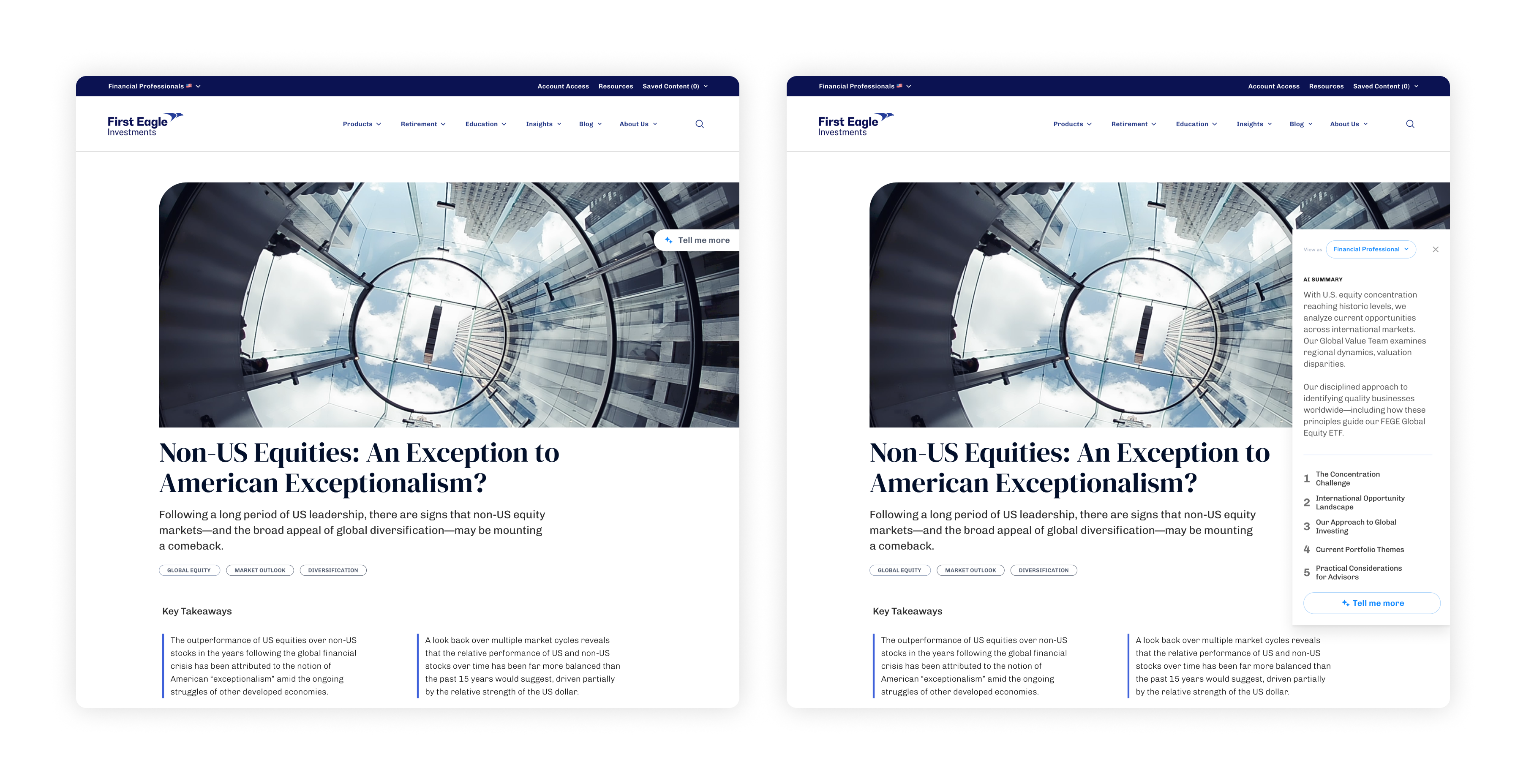
Content IntelligenceVisitors arriving at any article page could choose to open an AI summary before committing to the full read. A "Tell me more" prompt on the page triggered a tailored summary in a side panel, framed around what mattered most to their audience type. A Financial Professional and an Individual Investor clicking the same prompt on the same article received fundamentally different summaries.
For an institutional investor working through ten research pieces at once, that option was the difference between a site that respected their time and one that didn't. For an individual investor encountering First Eagle's investment philosophy for the first time, it was a way in that didn't require a finance degree.
Whatever the audience, the analyst's voice stayed intact. The reader just got a better door in.
How the system works across each audience. The same intelligence, delivering a fundamentally different experience depending on who is using it.
The strategy and vision were presented to First Eagle's leadership in late 2025. For a firm managing over $100B in assets, getting personalization right isn't a UX improvement. It's a business decision. The work gave First Eagle the strategic clarity to make it.