Redesigning the Goldman Sachs PWM design system to meet accessibility standards, enabling consistent and inclusive user experiences across all components.
Led accessibility enhancements for the design system, ensuring components met accessibility standards through refined colors, improved focus states, and enhanced legibility in data-heavy contexts. Additionally, I optimized the design system's usability for designers by adding detailed component descriptions, clear variant naming conventions, improved categorization, and leveraging Figma variables. These updates positively impacted all PWM experiences, including the homepage, onboarding flows and beyond.

ProblemThe PWM design system lacked accessibility compliance, leading to usability challenges for end-users and inefficiencies for designers.
TaskRedesign components and foundational elements of the design system to meet accessibility standards, improve clarity, and create a scalable, user-friendly framework for consistent experiences.
Identifying Accessibility GapsA comprehensive audit identified critical accessibility issues across the design system, including poor legibility in data-heavy contexts, insufficient contrast, and inconsistent focus states. These findings laid the groundwork for creating a more inclusive, user-focused design system.
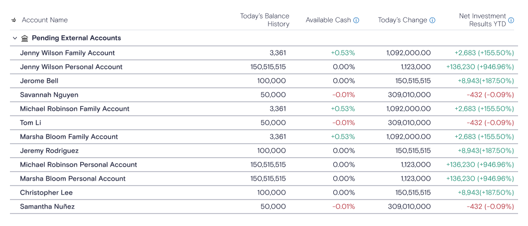
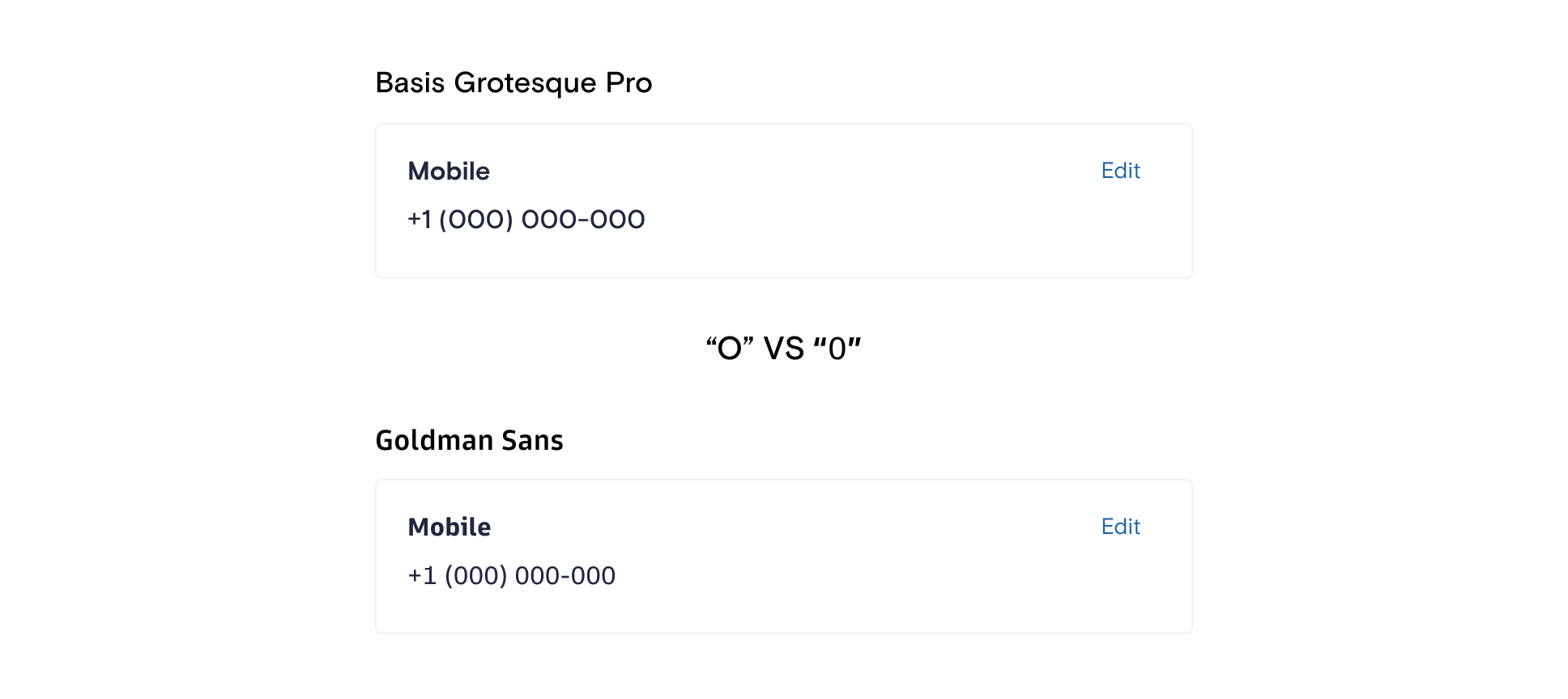
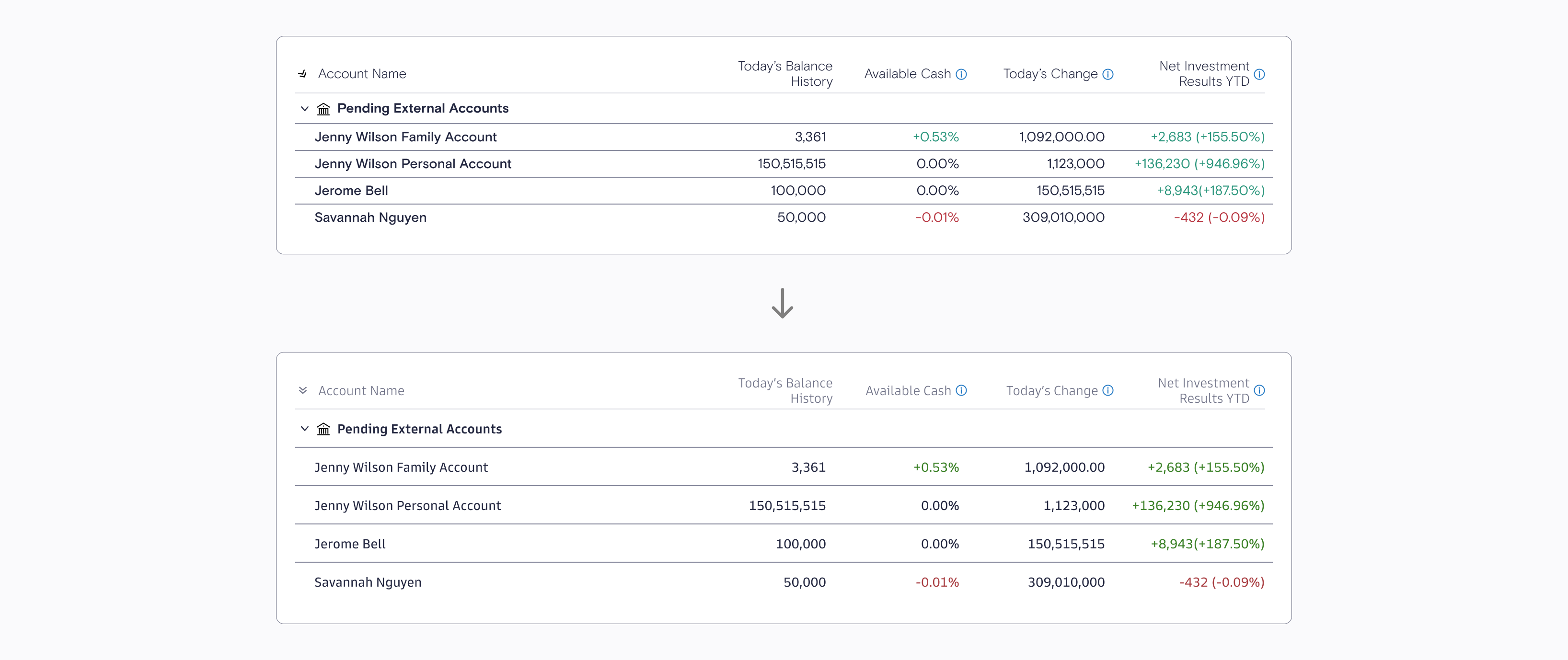
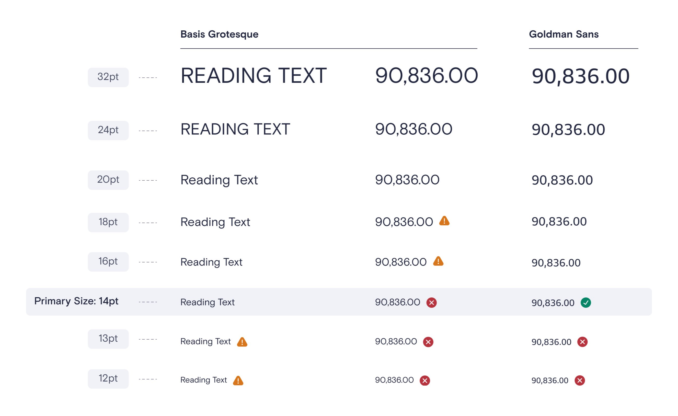
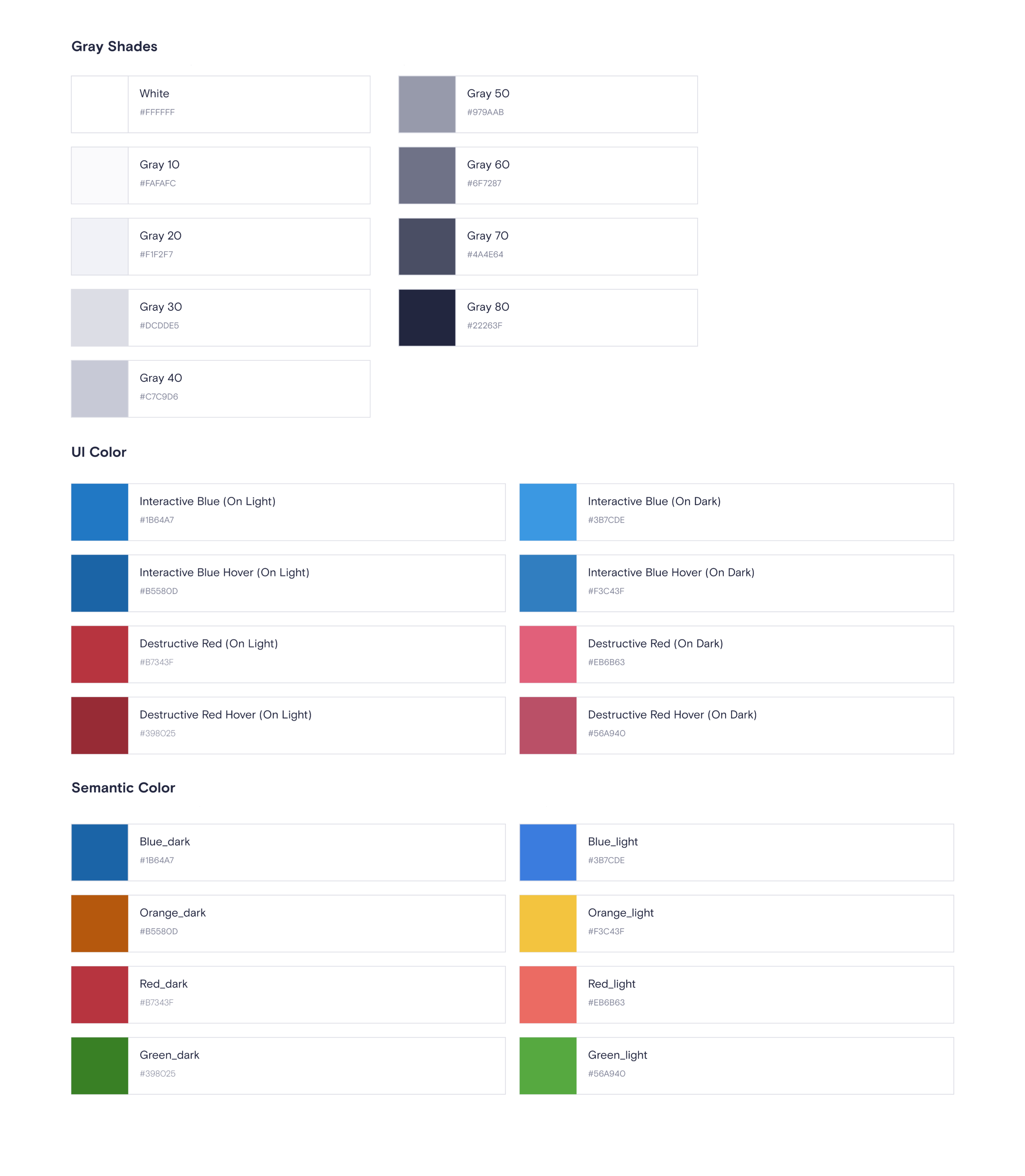
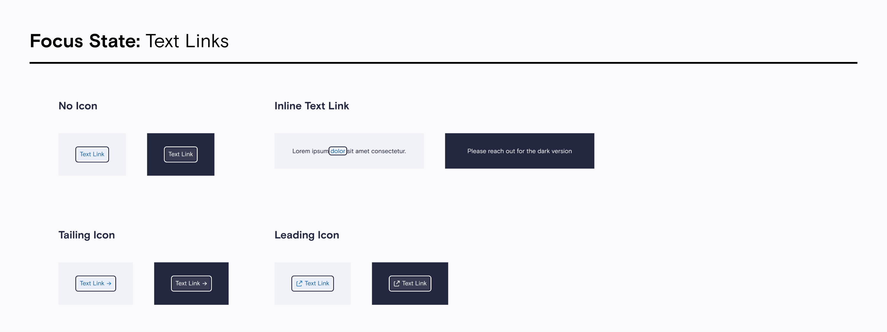
Primary Accessibility IssuesKey accessibility issues included poor legibility of Basis Grotesque Pro in data-heavy contexts, particularly the confusion between '0' and 'O,' insufficient contrast in badges, forms, and notifications, and inconsistent focus states that impaired keyboard navigation. These gaps negatively affected usability for both end-users and designers, necessitating a thorough overhaul.
Enhancing LegibilityTo address typeface challenges, I explored and tested alternative fonts, conducting side-by-side comparisons to ensure readability at small sizes while maintaining compatibility with the design system.
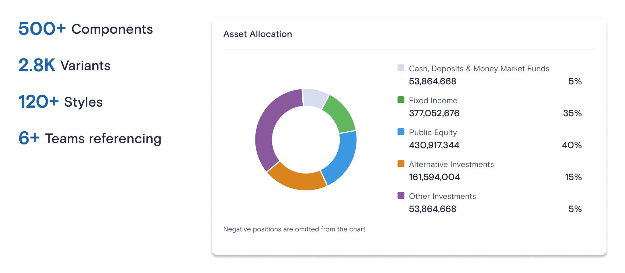
Validating Typeface and Semantic Color UpdatesI validated the updated typeface and numeral design through rigorous testing, ensuring clarity in data-heavy contexts like financial data and contact information. The refined semantic color palette enhanced contrast and readability, meeting accessibility standards across both light and dark modes.
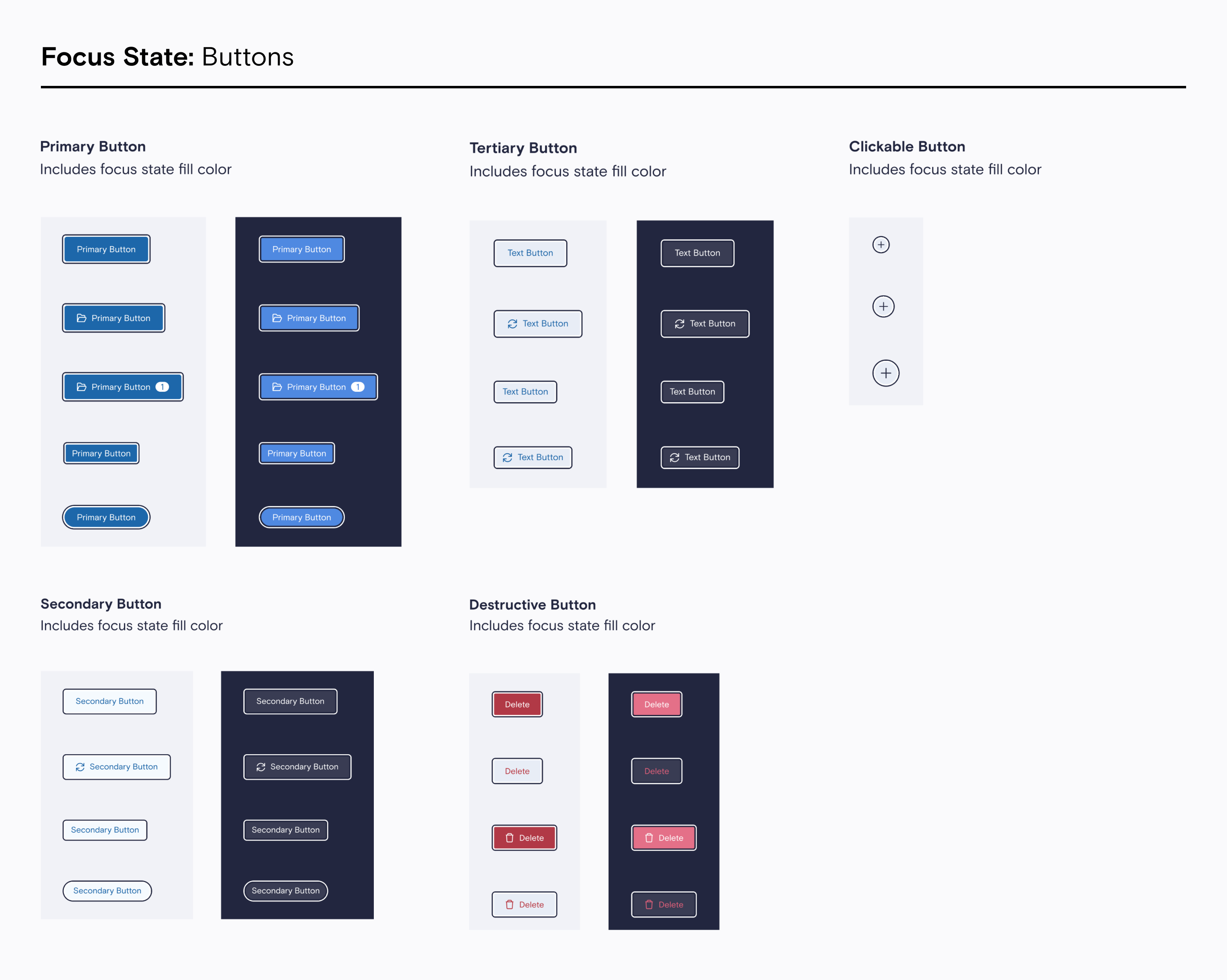
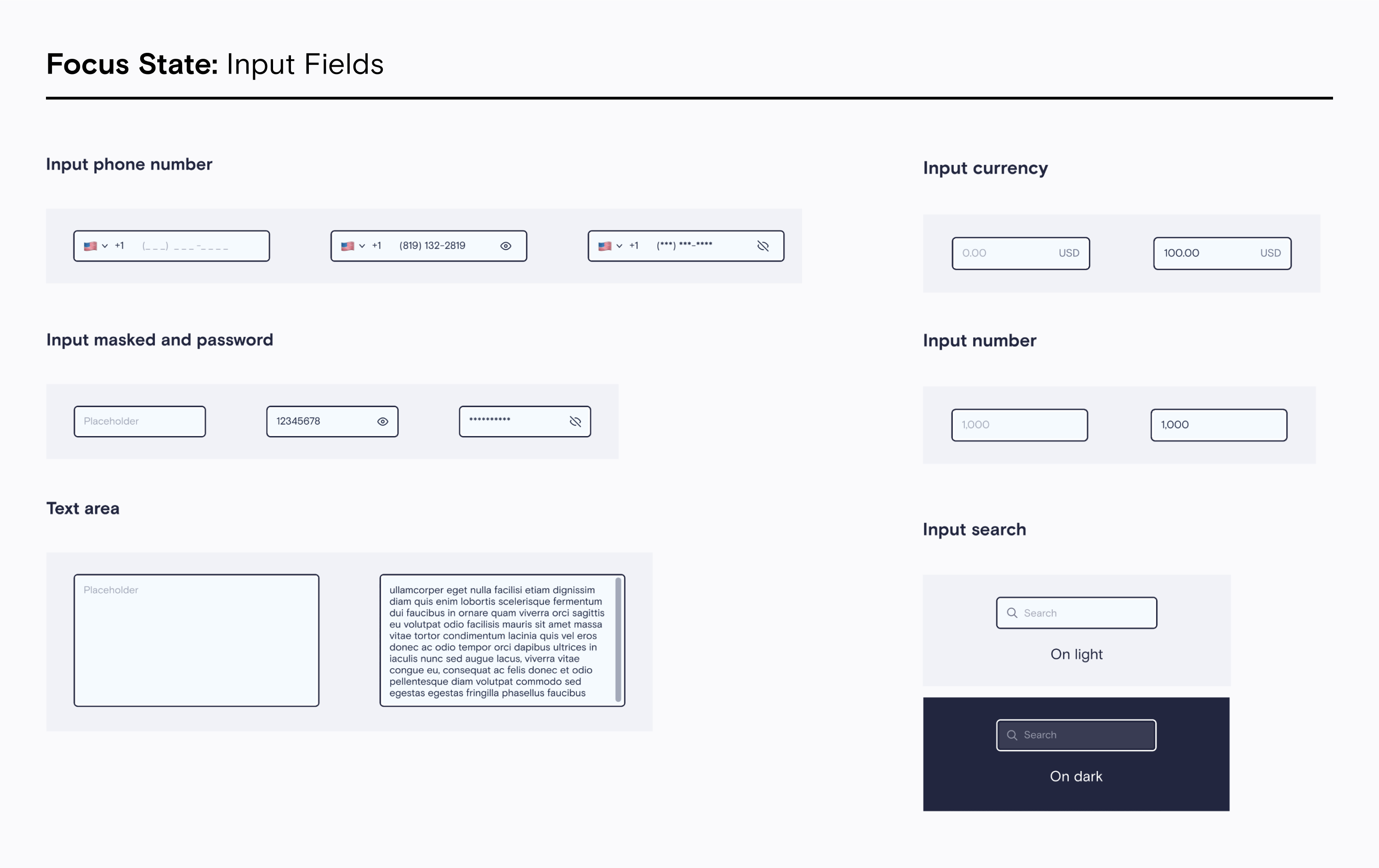
Defining New FoundationsAfter validating the updated typeface and color palette, I standardized focus states, text styles, and other foundational elements to ensure consistency and cohesiveness throughout the design system.
Enhancing the Figma Library for DesignersTo make the design system more accessible and intuitive for designers, I introduced enhancements to the Figma library. This included adding detailed component descriptions, labeling variants with clear naming conventions, and implementing better categorization. These updates ensured that designers could quickly understand the purpose and functionality of each component, reducing onboarding time and increasing workflow efficiency. By incorporating Figma features such as auto layout, nested components, variables and variant properties, the library became a more powerful and user-friendly tool, enabling seamless collaboration between design and development teams.
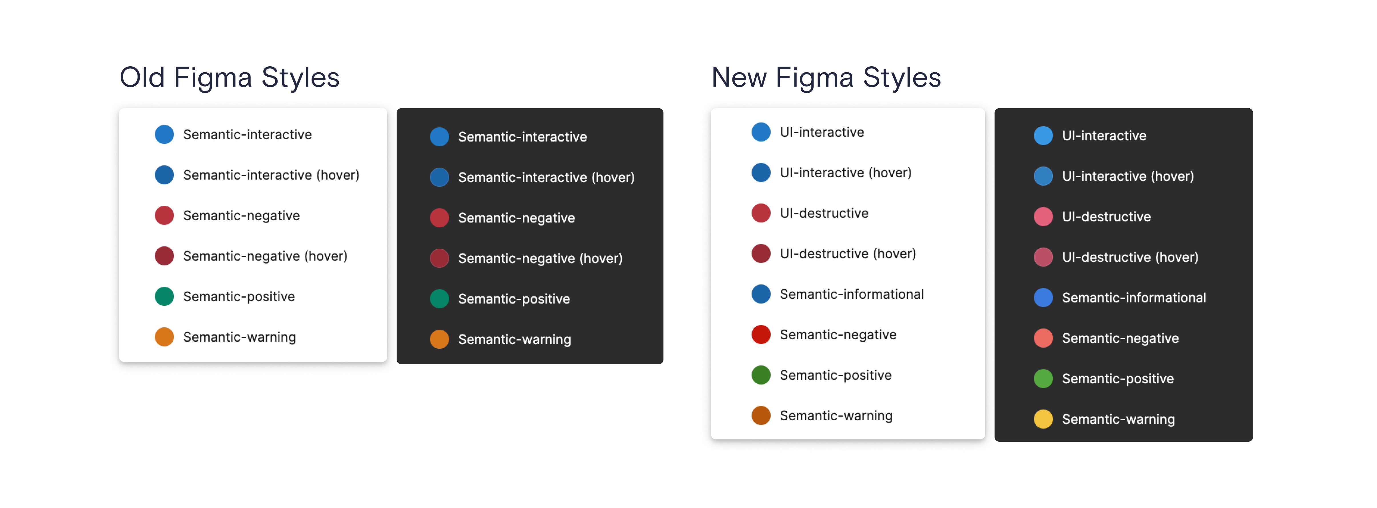
Tech DeliveryEvery detail of the accessibility enhancements was meticulously documented to ensure accurate execution by developers. This included providing detailed instructions for updating tokens with the newly refined semantic and tertiary colors that meet accessibility standards, with comprehensive documentation tailored for both light and dark modes.